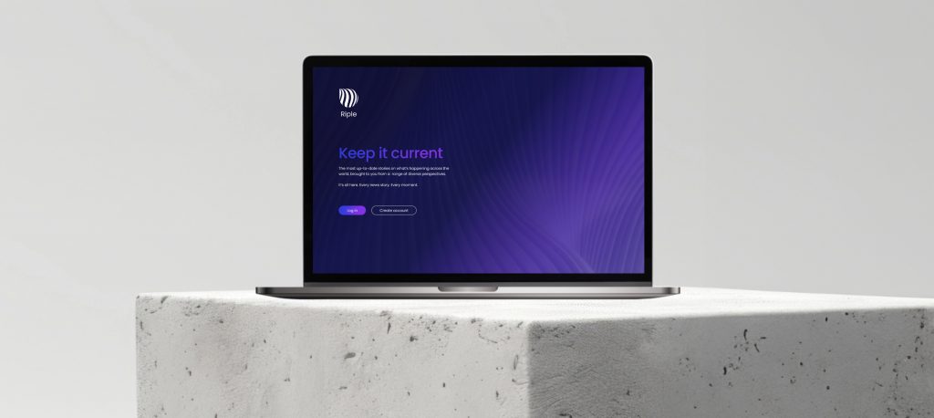
CLIENT: EMPACT CHICAGO HEALTHCARE
ROLE: UX DESIGNER (TEAM OF 3)
Ethnic minority groups continue to be underrepresented in cancer clinical trials, hindering our understanding of treatment outcomes. Empact Chicago assists minority women with gynaecological cancer to access and enrol in trials located in Chicago.
Empact Chicago work tirelessly to deliver educational programs and resources alongside support with transport expenses and advice from trained oncology nurses on treatment options.
BRIEF:
Increase the recruitment of minority groups to Empact Chicago’s clinical trials for cancer through improving their existing desktop site as well as developing an MVP for a new mobile app that will be part of a funding application.
The trial finder is a key feature in converting users into engaged trial participants.
Challenges
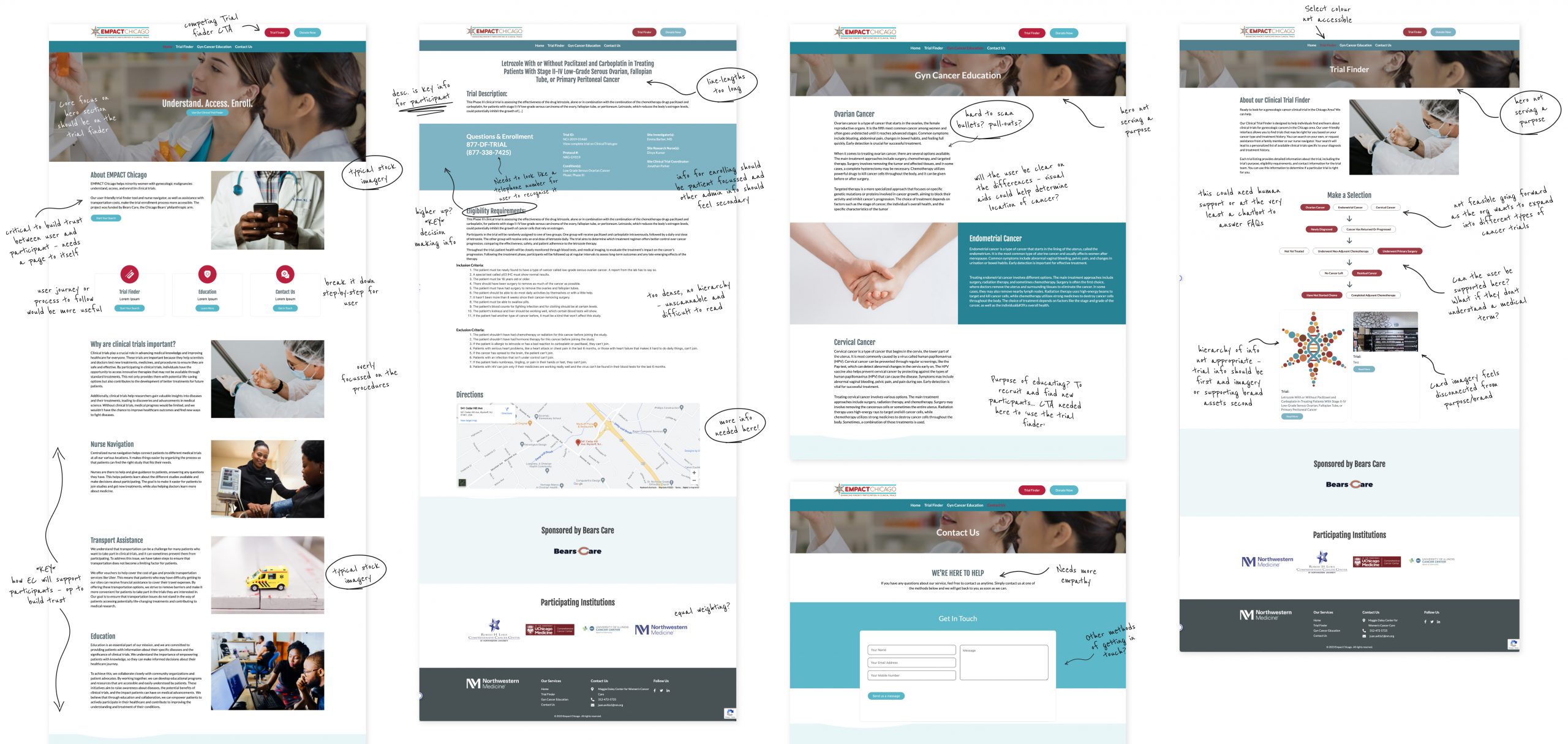
The existing user interface critically lacked a patient-centred approach throughout – not just within its imagery, language, tone of voice but also in the hierarchy of the information presented and signposting for users. It had a clinical focus that was hindering engagement as it didn’t provide reassurance and transparency about the trial process. Although the trial finder was functional, it lacked empathy and overlooked various opportunities to help users by providing explanations for medical terms and offering reassurance throughout the trial finder journey.
The site also contained a lot of medical jargon and dense paragraphs making the findability of information very difficult. And considering that English may not be the first language of our users, this all needed a rethink. Other accessibility issues such as a heavily condensed font, dark palette and an oversimplified navigation with competing calls to action, further compounded the challenges with the existing site.
Putting the user first
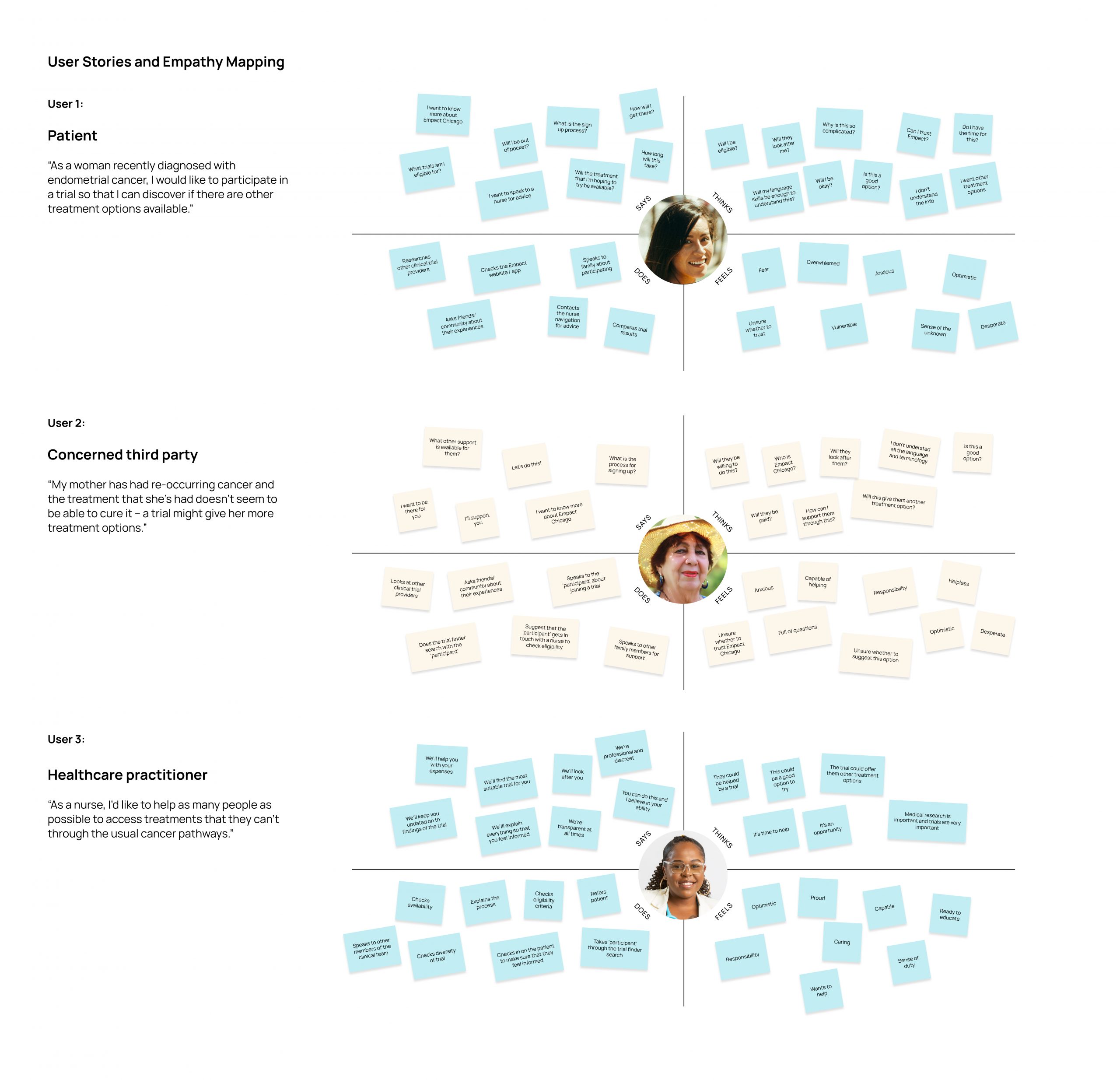
Three user stories were explored to gain a deeper understanding of the target audience, identify pain points, challenges and emotional responses along the user journey. The primary emphasis was on cancer patients though, as the trials exclusively targeted individuals diagnosed with cancer. As well as the initial desk research that was conducted, a range of cancer patients, their family members and healthcare organisations were also consulted.
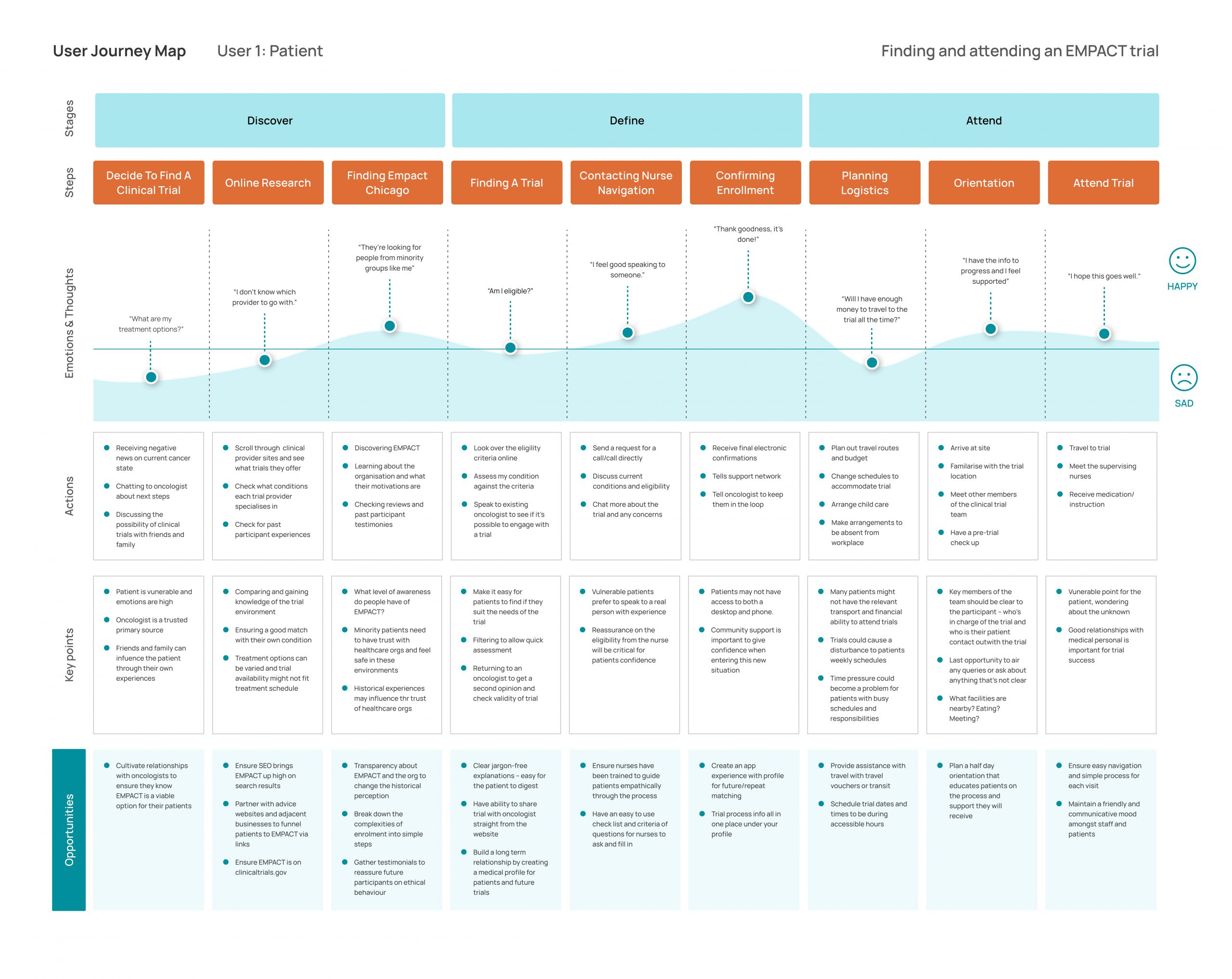
Approach
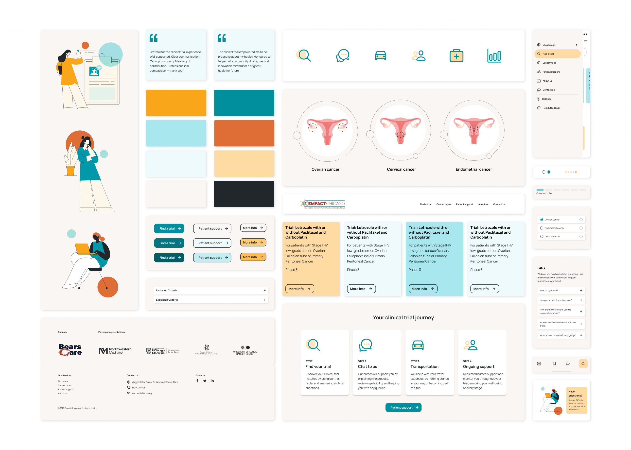
– Provide transparency by describing step-by-step ‘Your clinical trial journey’
– Share testimonials to build trust in Empact’s reputation for patient care
– Optimise all CTAs for the trial finder and nurse navigation to drive conversion
– Simplify medical jargon and terms
– Restructure hierarchy of content to be patient-focussed
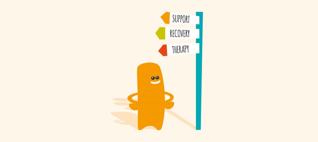
– Introduce iconography to help user navigate and scan easily
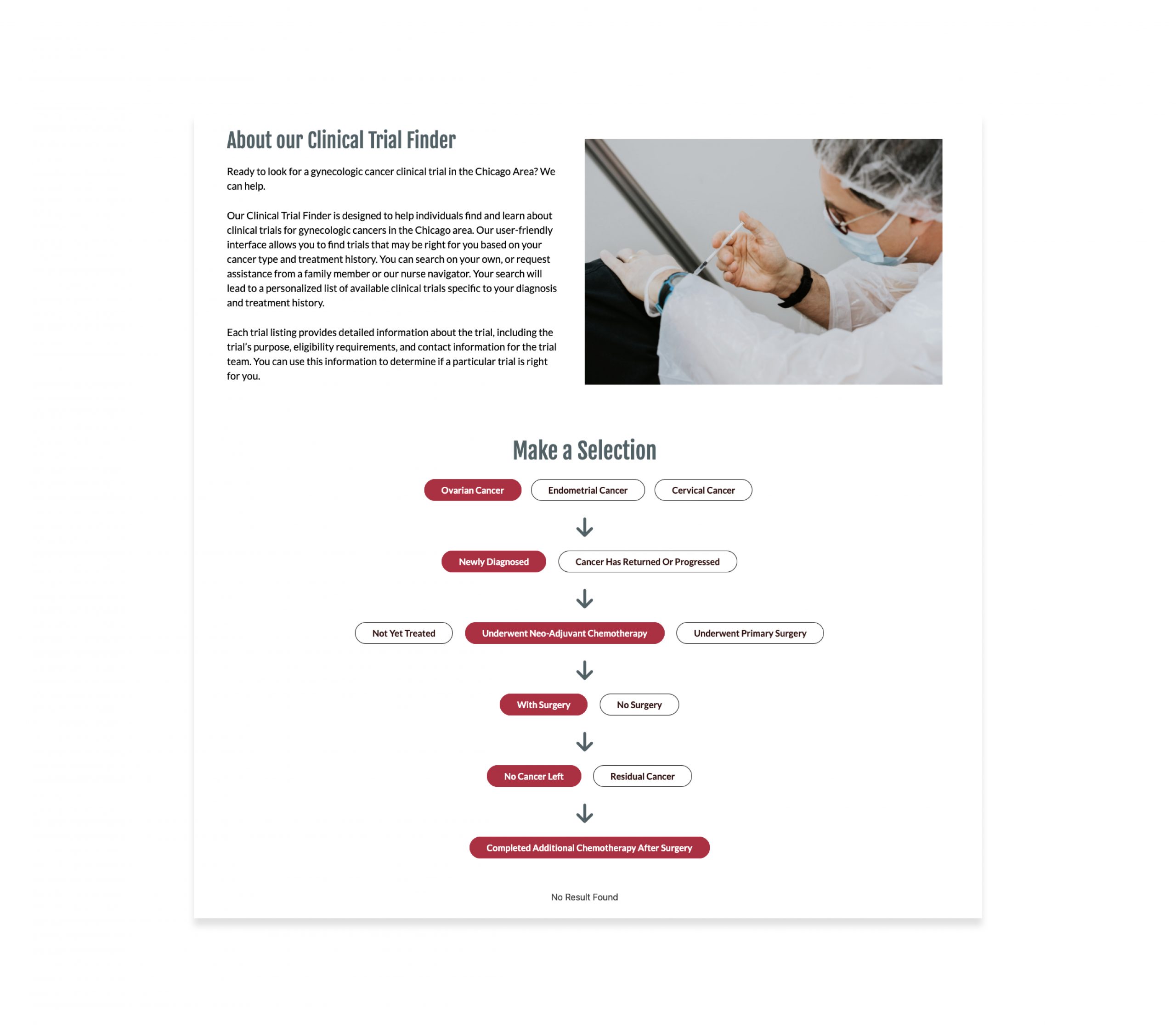
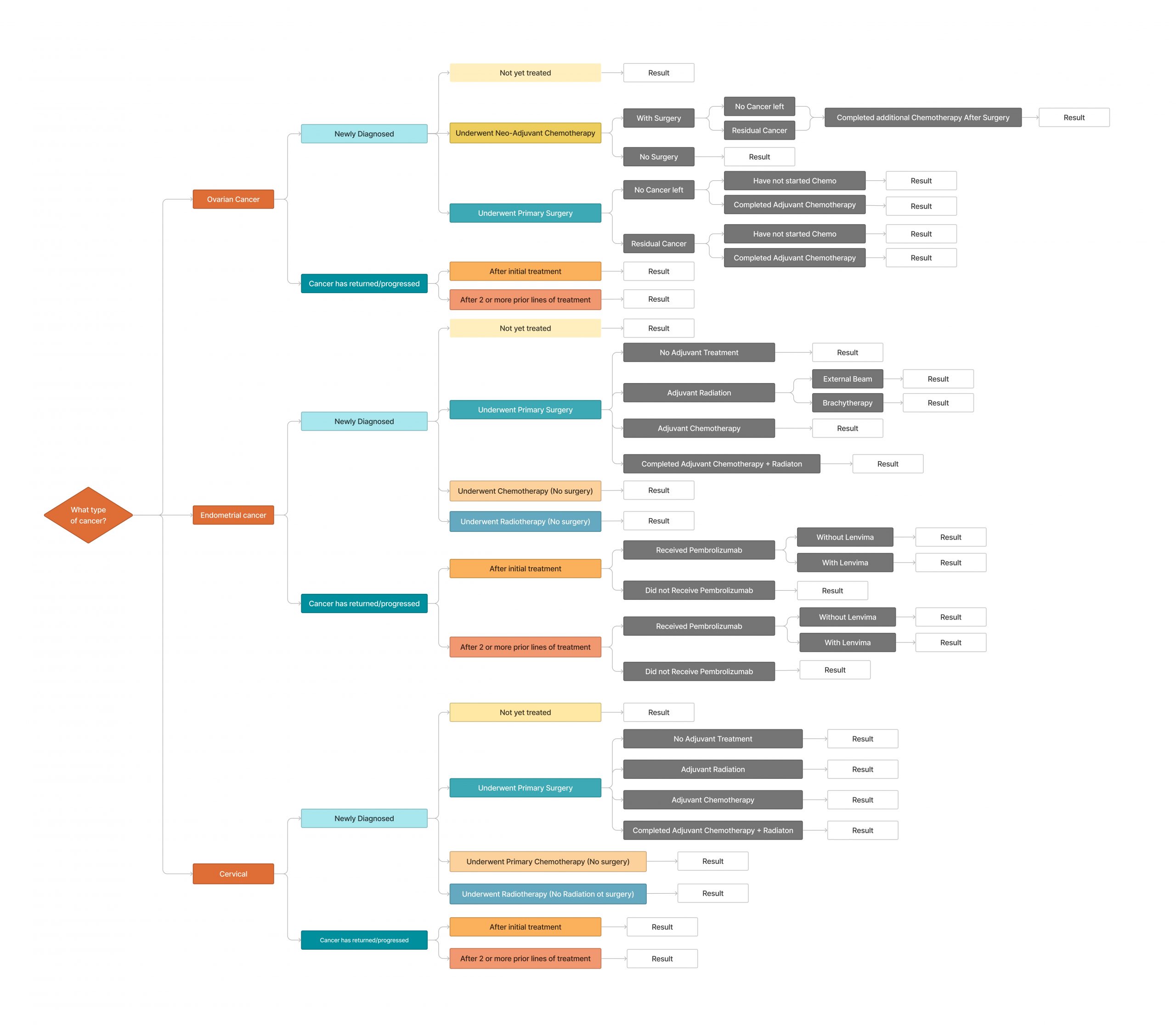
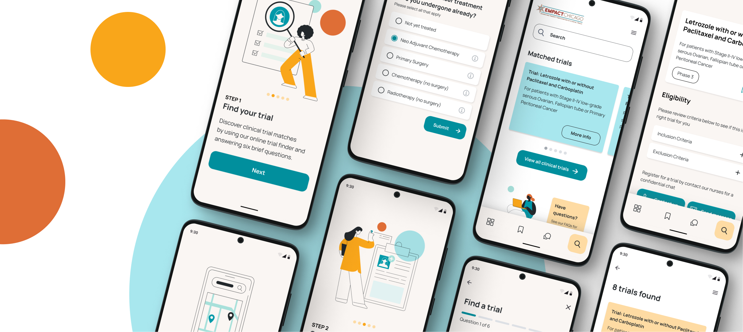
Simplifying the trial finder into five simple questions
The existing trial finder (decision tree above) was flowed to look for any patterns of repetition to find a more simplified format. By doing so, it uncovered that the entire flow (above) could actually be replaced by five simple questions. They were formatted as a simple form with tooltips explaining the medical terms and helping to inform choice as well as reassure the user as they progress.
The sixth question asks about ethnicity so that Empact Chicago can focus on diversity in their trials. A step-by-step status bar was included to keep the user informed of progress. And, so that the user always felt in control of the process, each step allowed the user to go back to the previous question as well as exit the process.
Research told us that cancer patients are understandably already in a state of overwhelm at diagnosis/reoccurrence so the aim was to reduce any further cognitive load. The process of going through the form might be slower than the decision tree but through progressive disclosure, there’s a critical opportunity to engage, support and convert the user into a participant.
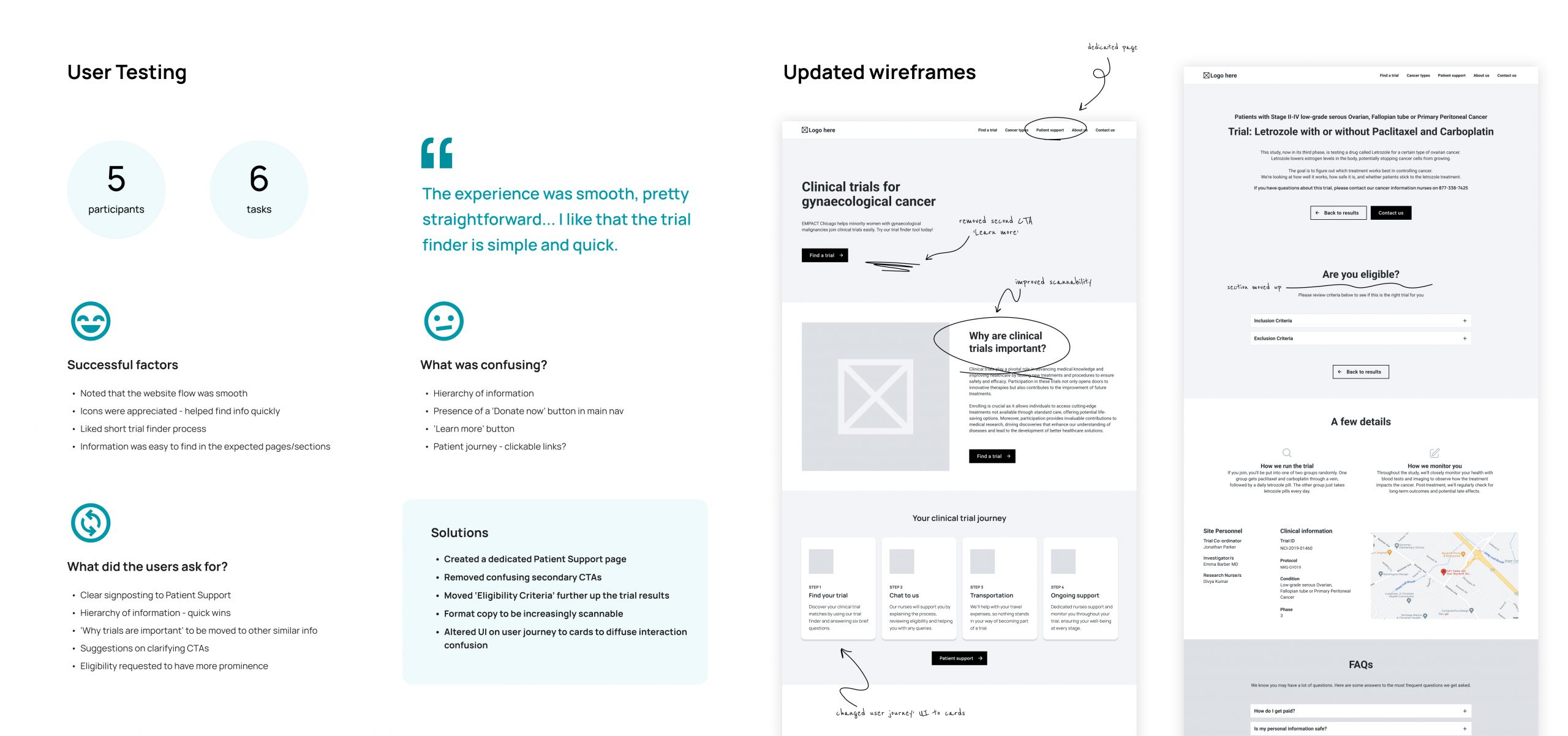
“The experience was smooth and pretty straightforward.”
(User testing participant)
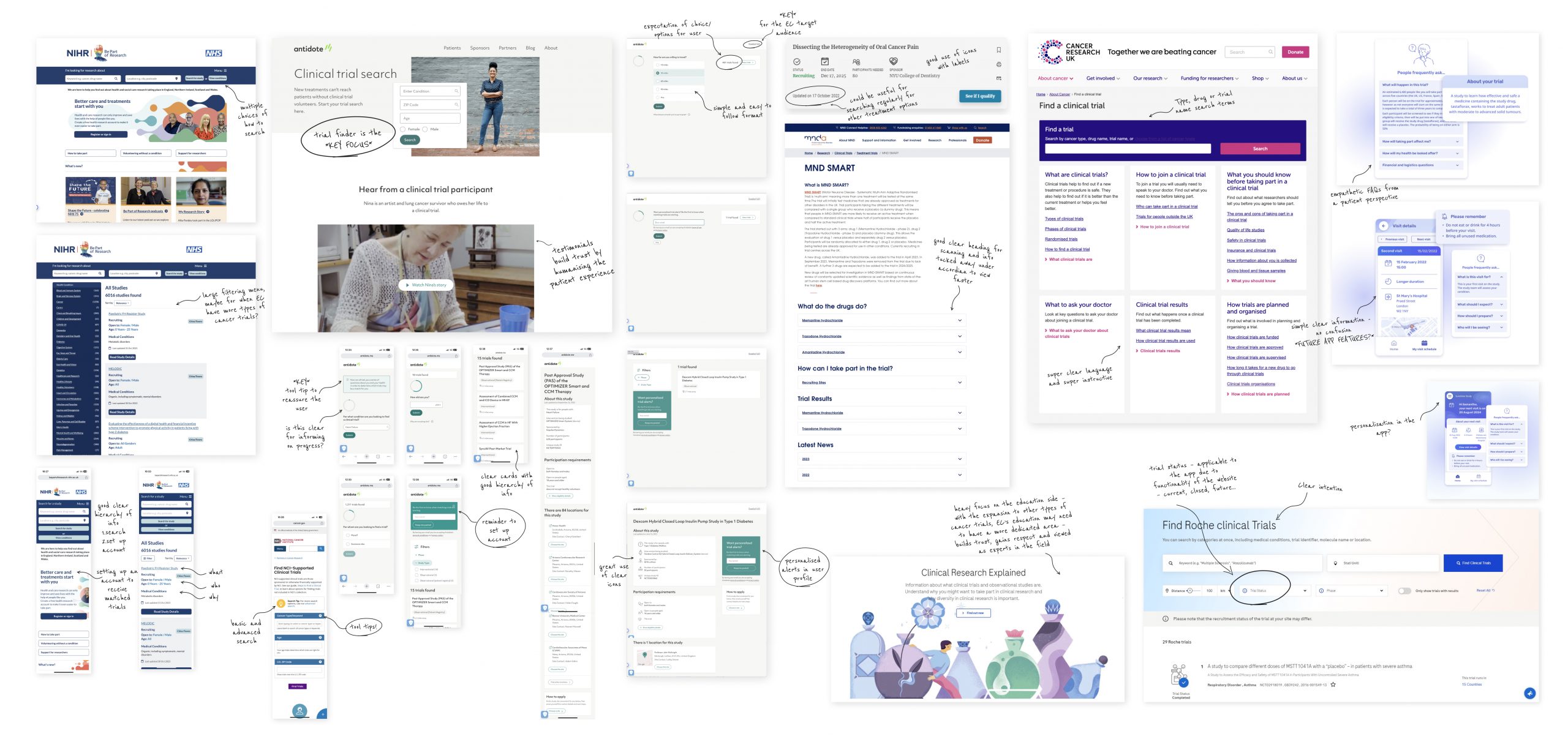
Five online user interviews were performed – they were task driven and the users were recorded using interactive wireframes. The tasks tested the findability of items across the site and the capability of the user to go through the trial finder without any help.
The user testing provided many crucial insights that were implemented into the next iteration of the site, as well as confirming some earlier assumptions about the information hierarchy and the need to simplify the content as much as possible.
Storytelling the clinical trial journey step-by-step
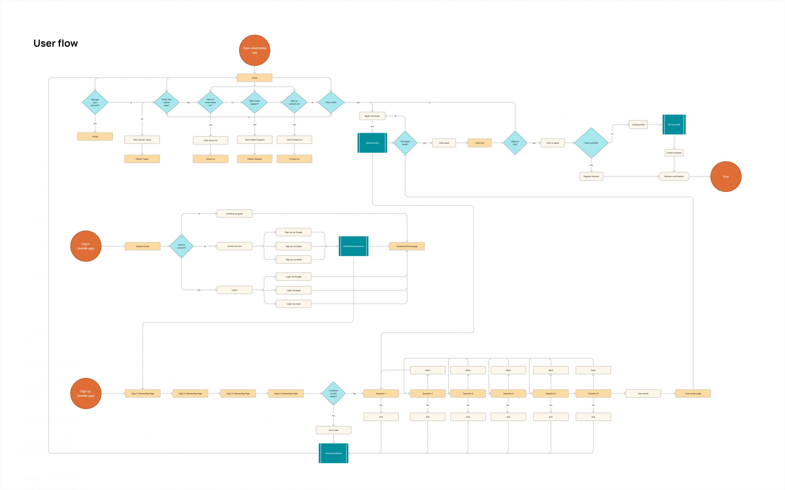
An onboarding experience was created for the mobile app to reinforce the step-by-step process for signing up to a clinical trial with Empact Chicago.
The ability to go straight into the trial finder before visiting the main section of the app was also created to speed up the search, as in some cases users will have been referred directly to the app by their healthcare practitioner after diagnosis. The trial finder mirrors the same simple format to the desktop site.
Empathetic signposting: using clear, bite-size informative prompts
Illustration was proposed instead of photography to capture a warmer and more approachable look without over-defining the user. Medical illustrations were also developed to describe the different types of gynaecological cancer, being careful to respect the delicate nature of representing a women’s body within these – isolating them away from a female form but still depicting the nature and location of the cancer. The iconography suite was focussed on signposting users through information or processes on the site, breaking them down step-by-step.
Empact’s colour palette was extended with a selection of gentle pastel colours, all based on their original corporate colours – all of which were AA WCAG standard against a dark shade. A new sans serif typeface with a large x-height was proposed to aid legibility and compliment the simplicity of the site.
Funding was successful and the app will launch in 2024!
The response from the client was incredibly positive and the MVP funding application was successful in February 2024, with plans for the app to go live later in the year.
The importance of consultation with their patient advocates and users from minority groups will be key to understand preferences and expectations, especially at crucial decision-making points. The trial results page remains a priority, being the final conversion point in the trial finder. It may also be useful to include the trial ‘duration’ and ‘type’ (observational or drug trial) here but this area will need further user testing to avoid making assumptions.
Exploring AI for the mobile app, particularly utilising a chatbot for pre-screening, was also proposed to minimise resources. The mobile app will feature a profile function for personalised trial matches and in-app notifications, while the desktop site has limited functionality due to the future funding being focussed solely on developing the app.
Project team: Wynne O’Brien, Valentina Miconi and myself